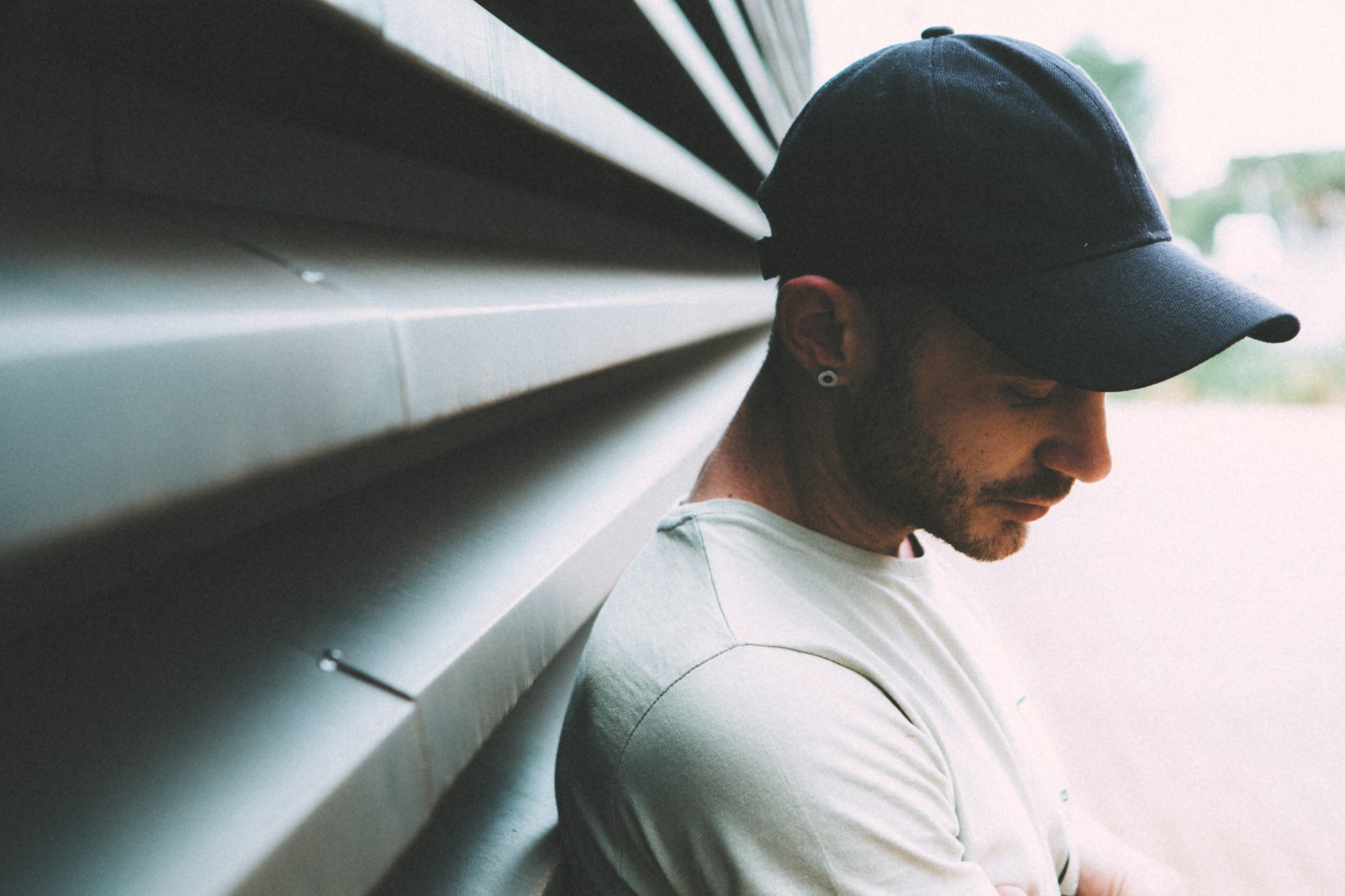
Pick up two baseball caps. One sits cleanly on your head, holds its shape after a year of wear, and still looks sharp from across the room. The other one started soft and broke down in three months — the brim warped, the embroidery frayed at the edges, and the crown lost its structure the first time it got rained on.
Both might have the same brand name stitched on the front. The difference is entirely in who made them and how.
Most people don’t think about this when they buy a hat. But if you’re building a brand or sourcing headwear at volume, it matters a lot — because the factory determines what’s possible, and no amount of brand positioning fixes a hat that doesn’t hold up.
Panel Tension: The Thing You Notice Without Knowing What It Is
A structured cap is made from six panels of fabric sewn together around a buckram insert that gives the front its stiffness. The way those panels are joined determines whether the hat sits symmetrically on your head or looks slightly off — like it’s leaning, or like the seams are pulling toward one side.
Bad panel tension is hard to describe but easy to feel. Put a low-quality cap on and look in the mirror: the logo placement drifts slightly, the crown shape is uneven, and the side seams don’t align cleanly with your ears. It’s not obvious if you’re only looking at one hat in isolation, but put it next to a well-made one and it’s immediate.
Getting panel tension right is a skill that comes from experienced operators, calibrated machines, and consistent fabric sourcing. It’s not something you can QC your way out of at the end — it has to be built into the process from the cut stage. A hat manufacturer that’s been doing this for 20-plus years has worked out those calibrations. One that’s newer or less specialized tends to show it here.
Embroidery Density: Why Some Logos Look Raised and Others Look Flat
Digitizing — converting a logo into a stitch file — is where embroidery quality starts. A well-digitized file tells the machine exactly how many stitches to lay down in each area, in what direction, and with what underlay. A poorly digitized file treats every element the same way regardless of size or fabric type, and the result looks flat, pulls the fabric, or frays at fine details.
The density matters. Logos with thin lettering or intricate lines need a different stitch approach than a bold icon. On a structured cap with a stiff front panel, the settings are different again from a soft unstructured crown where the fabric has more give.
What you’re looking for: embroidery that sits cleanly on the fabric without puckering around the edges, fine lines that read clearly rather than blurring into each other, and a slightly raised profile that gives the design visual weight. If the logo looks slightly sunken or the thread pulls the surrounding fabric into a ripple, that’s a digitizing or tension problem that comes from the factory, not the artwork.
Brim Curvature: Small Variation, Big Visual Difference
The brim of a baseball cap goes through a shaping process that sets its curve. Different styles call for different curves — a flat brim sits at zero degrees by design, but a curved brim that’s supposed to be consistent at 35 degrees will look noticeably uneven if some units come out at 28 and others at 42.
For a brand that sells multiple colorways of the same style, brim consistency matters because customers compare units. Someone buying a second hat in a different color expects it to match the silhouette of the one they already own. If the curvature varies by batch, the product feels inconsistent even if every other quality metric is the same.
Good factories control this with tooling and inspection. Cheaper production skips the tooling and relies on operator feel, which introduces the variation. It’s not dramatic on any single hat — just enough to make the product look slightly off across a collection.
Interior Finishing: Where Brands Often Stop Looking
Flip a cap inside out. What you see there tells you as much about manufacturing quality as what’s on the outside.
The sweatband — the fabric strip that sits against your forehead — should be sewn evenly, lie flat, and be made from material that doesn’t scratch or absorb moisture in a way that stains. Cheap sweatbands use thin acetate or rough polyester that feels noticeably worse after a few hours of wear.
The crown lining, if there is one, should cover the seam allowances cleanly. Exposed raw seams inside the crown aren’t a structural problem, but they’re a finishing detail that signals how much care went into the production process overall.
The closure hardware — snapback plates, fitted elastic, or buckle straps — should sit flush with the back panels and operate cleanly. A snapback that clicks unevenly or a strap that bunches when you adjust it is a small thing, but it gets touched every time someone puts the hat on.
Why This Matters if You’re Building a Brand
A hat brand’s reputation is built slowly and damaged fast. One strong season of product quality creates customer loyalty. One weak batch — embroidery that frays after two months, brims that warp in summer heat, sweatbands that stain — generates returns and the kind of negative feedback that follows a brand for years.
The brands that avoid this don’t do it by catching problems in final inspection. They do it by working with factories that have the processes, equipment, and experience to not create those problems in the first place. That means fewer surprises, more consistent output across production runs, and a product that actually matches what was approved in sampling.
The hat on someone’s head is the most direct brand expression you have. The factory is the one actually making it.